Traditional media is a door to greater visibility. We all know that marketing in the online landscape is all the rage these days. However, this fact can never take away the effectiveness of poster advertising for any brand.
We’ve seen movies, festivals, musicians, farmer’s markets, communities, politicians, and more put up a remarkable poster design of their own. It has a diverse set of applications. This marketing tool is used as a way to spread awareness and inform people of announcements, propaganda, products, and the likes.
No matter how you plan on using it, we can all agree on one thing. Putting informative graphics up on walls, whether it be on the internet or in the streets, is a timeless strategy. It is what gets your brand message across your audience. To get the most out of your poster campaign, here’s what you need to know about this asset:
Get ready to impress your audience with a poster design they will surely remember. You will learn how to use posters to achieve your campaign goals.
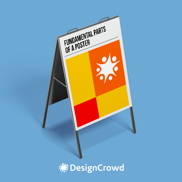
Fundamental parts of a poster
Before we start, let’s take a quick trip down memory lane. Let’s pay respect to the art of poster design by talking about its roots.
Historically, the role of a poster has always been to relay information to people even from afar. The art form has helped usher in art movements like Art Nouveau, Modernism, and much more. Posters used to be created through lithography or the process of printing using limestone, oil, and water.
It was used to encourage military enlistment, proliferate propaganda, advertisement, and more. Typography and illustrations were a poster’s best friend. Regardless of what you will use your poster for, incorporating essential parts lets you maximize its potential.
You don’t need to stress out over your promo materials, there’s a basic formula to create a phenomenal poster design:
Headline
What is your poster for? Is it for a product launch or a huge sale event? Well, whatever it is, it should be directly communicated right off the bat. This part of your poster is the most important. Meaning, it should be prioritized in the design’ visual hierarchy. Your headline should be designed in a way that would be hard to overlook.
For example, if your poster is meant to be a safety advisory, the focal point of the poster should clearly state it.
Take a look at this workplace notice. The most prominently displayed text is displayed using a readable font. Passersby can be made aware of the protocol even from a distance.
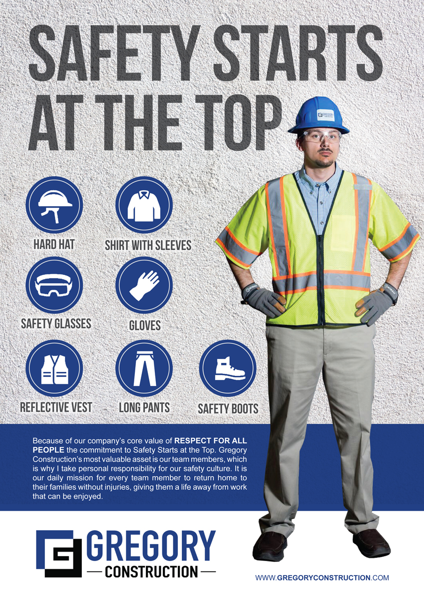
Company Poster Design by rkailas
Content
Big statements need to be substantiated with context. This is the part of your poster that will instruct and inform your readers further. It includes details, footnotes, and most importantly, your CTA. Think about this part as the answer to the question of “What’s next?”
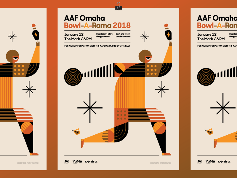
AAF Omaha Bowl-A-Rama 2018 Poster by Sean Heisler
Just look at this bowling event poster designed by Sean Heisler. The poster contains the venue, date, time, participating brands, activities, and even a CTA to the event website. This is a great example of maximizing your poster ads. You can use it to help drive traffic to your online marketing channels as well.
The layout presents the information text well by framing it with two lines that stand as a border. It gives the information a more defined appearance.
Illustration
Professionalism, joy, excitement, and other complex themes—these traits can be portrayed through a self-explanatory drawing. With strategic use, it can also make it easier for your readers to understand information. Illustrations are powerful tools to evoke emotion from your audience. This is where you can creatively express your campaigns’ themes and objectives.
Plus, these drawings can help you draw more attention to your poster. This standup comedy poster by creative ride uses wacky characters to portray the silliness that awaits event-goers.
The event has a unique theme where the audiences are encouraged to interrupt the performers amid their skit. It’s a bold invitation and the organizers needed an equally brazen poster to promote it. The designer took a modern and minimalist approach to create a high-impact design.
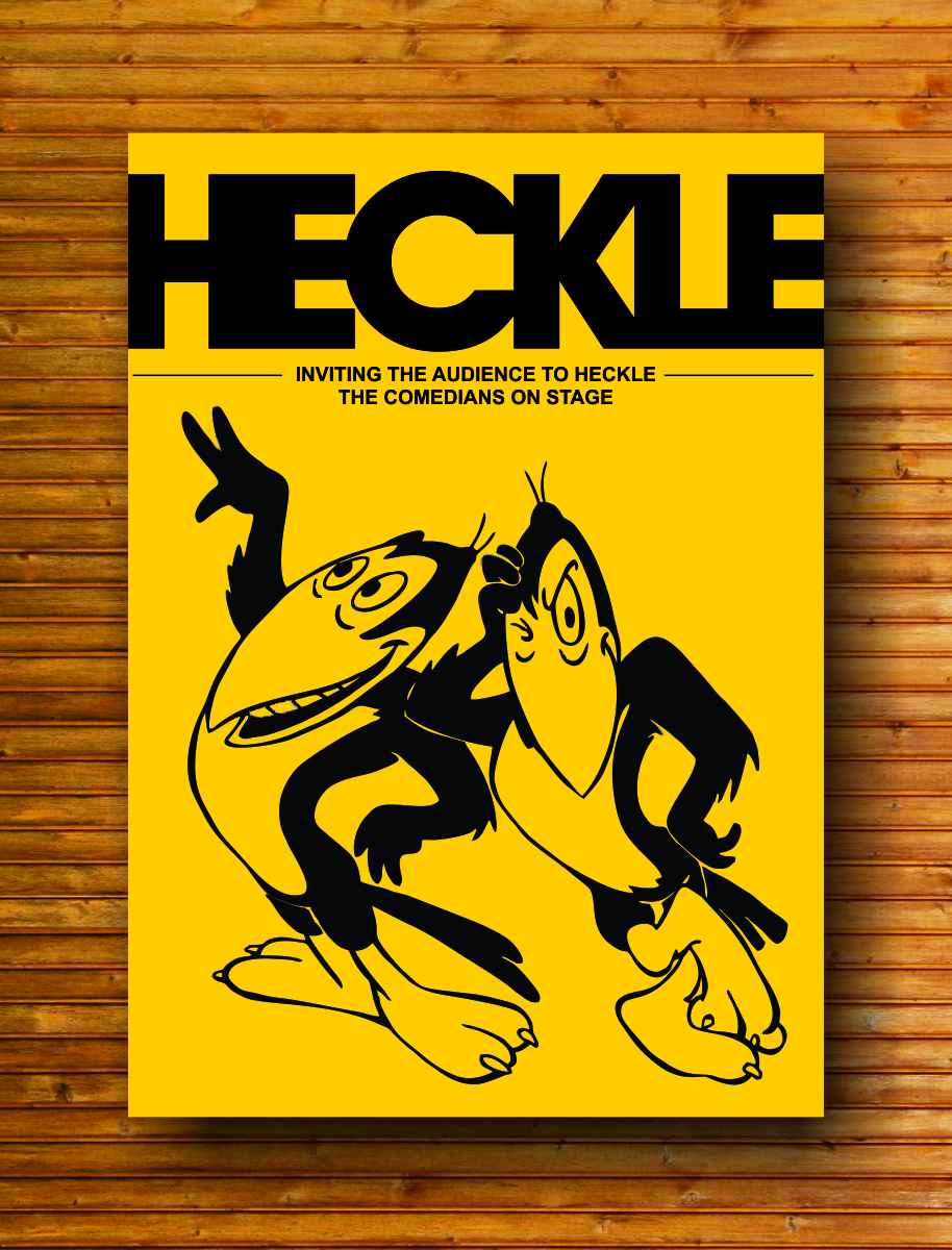
Stand Up Show Poster by creativeride
Pro tip: Sketch it out
The parts of a poster can be overwhelming especially for beginners. Try taking it one step at a time by sketching an outline of your design concept.
A quick sketch is the starting point of any effective design. Doing this will give you a better idea of how you can improve the overall composition of your signage. Graphic designers recommend starting with a prototype before they continue pursuing a concept.
Branding
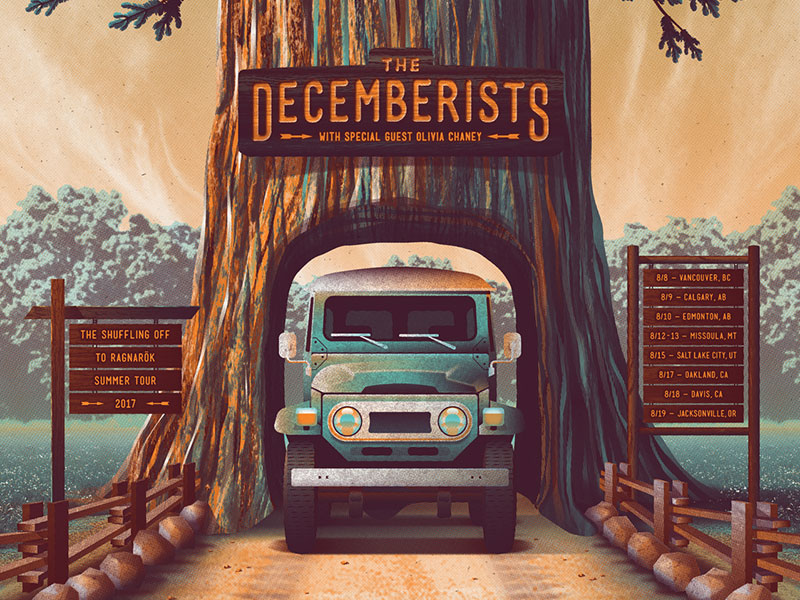
The Decemberists 2017 Tour Poster by DKNG
The goal of promo materials is to spread awareness of your brand. One way to do this is to incorporate your company’s visual identity into the design. You can do this by using elements and themes that match or complement your branding kit.
Like this concert west coast summer tour poster of an indie rock band. It features an illustration of a bus passing through a scenery on the west coast. The landscape is reminiscent of states like Oregon. It has a camping and road trip theme which fits the campaign very well.
You will also see the band name immediately because of its strategic placement. The illustration of the tree base also leads the eyes of the audience to the band name.
Pro tip: Don’t forget about your logo
It goes without saying that your brand is the star of your every campaign. Emphasize your brand identity by displaying your business logo. Designers recommend that you put brand symbols in the upper region of the signage. This will give it higher chances of being noticed by your audience.
For those who still don’t have a graphic mark to represent their brand, check out this easy-to-use logo maker.
Best Practices & Common mistakes

You’re probably reading this because you’ve heard of the advantages that poster advertising gives brands.
In 2019, a study by Statista showed that people still trust traditional material like posters. This could be explained by the growing distrust of people with online information. Atop of this fact, audiences also enjoy reading information off of printed assets over digital ones.
But brands can only leverage this marketing instrument if they design and apply it correctly. You can follow the poster design best practices to drive results with your poster. Here are guiding principles for your next poster campaign:
Use vector graphics when possible
Pixelation is one of the most common problems faced in graphic design. Some design proposals may look good on screen, but that does not always translate to printed materials. When displayed on a large scale, materials tend to lose their quality.
As an alternative, other designers use vector graphics which are mathematically produced figures that adapt easily to different resolutions. Raster images, their counterpart, are often veered away from due to their lack of versatility.
Visual hierarchy is important
Even if you have individually well-designed elements in your design, these components must be strategically placed in order to make the most out of them. This is where visual hierarchy comes into play. Organizing your content and graphics in an intuitive manner makes it easier for the audience to digest information.
Proper visual order can be achieved through different means. You can use patterns, color, placement, animation, size, and even mathematics to achieve this. For example, when designing concert flyers, a strong visual hierarchy ensures that the event name, date, and location stand out, grabbing attention immediately. This design best practice helps readers digest faster and better. The proper visual hierarchy will also allow you to give your call-to-action some extra love.
Stay on theme
This applies to the purpose of your campaign and your branding. There’s nothing wrong with experimenting and going on the unbeaten path. But that doesn’t mean you have to take your design to another planet.
Remember that you want to be recognizable, meaning there should be relevant visual cues to your company and to your campaign. Before you start printing out batches upon batches of your poster, evaluate the design. Check if it looks similar to something that your competitor has done before. Competitor research plays a part in the improvement of your poster, too.
Tell a story
Tell a story. Not just any story. But a story that your audiences will enjoy. Whether through witty copy, striking graphics, or a mix of both—a compelling visual narrative helps create relatable and meaningful connections.
Brands such as Dove, Smirnoff, and more are now dedicating efforts to emotional marketing. This is because the strategy is said to provide better results in the long run. Consumers use emotions to judge how loyal they will be to a brand. And when they are loyal to a brand, they tend to spend more money on that company’s goods and services.
Know who you are talking to
Would your audience appreciate a modern art style or a vintage one? Identify the demographic of your audience and gauge what they will like better. Signages only have three seconds to be noticed and it’s best if you show your target audience what they want to see during that span of time.
Those points are the best practices for designing a poster. This marketing tool is trusted by marketers to improve brand visibility, credibility, and local impact. Plus, this material is one of the most affordable choices in the market. The cost of a poster campaign is only a fraction of a TV advertisement.
Let’s give a quick run-down of the common mistakes people make when designing a poster. This way, you can familiarize yourself with both the dos and don’ts of poster design.
- Using generic-looking poster templates - There’s nothing bad about using poster templates. You can achieve spectacular results as long as you know how to source and edit one according to your needs. Take note that commonplace templates are less likely to become remarkable. This doesn’t apply to posters alone, but to other materials like logos and other branding kit components as well.
- Forgetting the CTA - Make your content more actionable with a CTA. A good call to action is characterized by a well-written copy and strategic design to capture the attention of passersby. Think of CTAs as a method for you to encourage conversion.
- Making color accuracy an afterthought - One of the most common mistakes when designing printed collaterals is color accuracy or lack thereof. There are two different color spaces called RGB and CMYK. RGB (red, green, and blue) refers to primary colors seen in light, while CMYK (cyan, magenta, yellow, and black) are the primary colors for pigment or printing.
Most, if not all, companies now rely on digital means like raster editors to create their designs. Some use RGB color spaces which results in color mismatch during printing. The standard is now CMYK for printing. To avoid budget-slashing redesigns and reprinting, remember to set your colorspace to CMYK for your printed projects during the design process.
- Poor readability - You only have limited time to have your poster remembered. Making the most of that window can be improved by readable typography. It drives information processing faster by being easy to read. Choosing the right design elements such as space, color, and fonts are great agents for effortless reading.
For starters, you can choose fonts like Roboto, Verdana, Helvetica, Garamond, and Open Sans among others to instill readability.
Examples of a great poster
We see thousands of ads daily. In fact, the market is so saturated that people have actually developed banner blindness or avoidance of ads done whether consciously or unconsciously. Still, there are great examples of poster design that overcome this.
For this section, we are going to check out posters that you can easily recognize.
You may have seen them online, mall entrances, conventions, supermarkets, train stations, bus stops, other crowded public places, and other areas perfect for signages. Get ideas and inspiration for your next poster project from these remarkable examples:
We Can Do It!
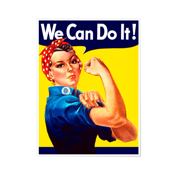
World War II caused women to take the place of men who were deployed for war. They had taken on jobs in factories and other defense industries. The poster was created to shape culture and encourage women workers into the said line of work.
It depicts a character named Rosie the Riveter who is a housewife. She has a speech bubble with a catchy and compelling copy.
Jaws
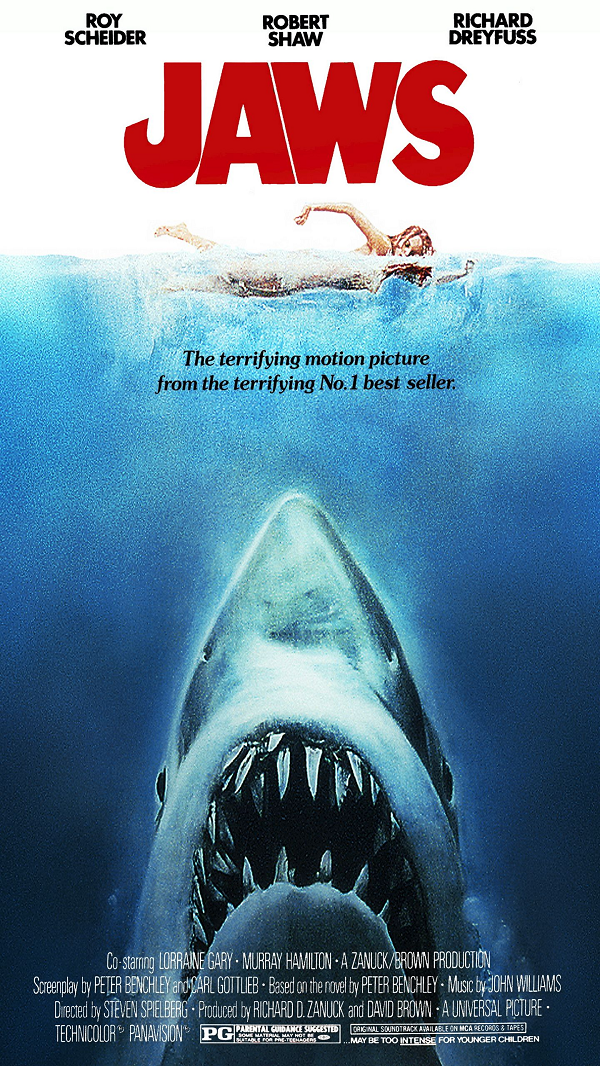
Possibly one of the most iconic shark films of all time, this 1975 poster was designed to tell a story. The art director wanted a big and realistic shark that looms to a swimming human. It gave Steven Spielberg’s thriller film a daunting design.
Got milk?
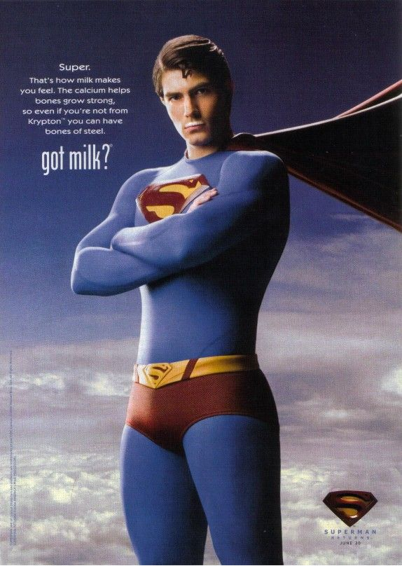
The ‘90s was a high time for encouraging more consumers to drink milk. The campaign was fronted by different celebrities that pose with a milk mustache. The American campaign worked with stars like Hugh Jackman, Whoopi Goldberg, and others. In 2006, they worked with Brandon Routh as Superman.
Governors Ball
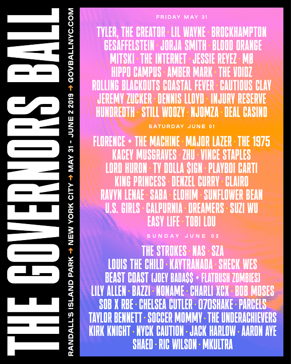
Since 2011, the Gov Ball has been featuring different artists during a multi-day music festival. It is held at Randalls Island in New York City. The poster for the brand’s 2019 concert has a colorful gradient background that provides good contrast between the text. The poster is trendy and easily captures the eyes.
Guide to printing posters

So, you’ve got a good design concept in your mind. You can maximize your design’s potential by optimizing it for printing. There are a few factors that you need to be mindful of when designing a poster. This applies to designs even if you plan or don’t plan on printing. Paying attention to these details will help you reduce the risk of making mistakes during production.
Size and resolution
Defining what size you want your design to be printed in helps you estimate what size your draft file must be. The rule of thumb in print is to allocate 200 up to 300 inches of pixels for every inch. There are a lot of size options for your signage, but below are the common dimensions that brands use for their posters:
- 8.5 in x 11 in
- 11 x 17 in
- 18 x 24 in
- 24 x 36 in
Those dimensions allow for posters to be seen and understood for people passing by.
Material
Posters are often displayed and exposed to different environments. Some are put up indoors while some face the harsh climate of the outdoors.
For a print design project that will last, coated papers or papers that have a layer of polymer on top of them can be your best bet. Glossy and semi-gloss are a popular choice for poster printing. The material helps the print survive from being tarnished by the elements. This type of paper also prevents ink from bleeding during the printing process.
CMYK vs. RGB
Remember that these color spaces are not the same. It is best to design a poster in CMYK when you plan on having the poster printed out. This yields color accuracy for design projects that will be used for non-online purposes.
Where can you get a poster design?
Brands have their own ways of getting a poster design for their campaign. Take a look at this section to give you some idea of where you can get one of your own.
Poster design templates
You can find templates from online poster makers on the internet. Most platforms offer free designs that are great for students and brands that do not have big budgets. However, since they’re free, it is likely that it’s been used a lot. Remember to personalize the design to make it more unique and unforgettable to your audience.
Start from scratch
You can make a design through digital or traditional means. Taking the full DIY route will help you take more control of the results. When starting from scratch, take note of the poster design best practices and be creative to yield impressive results.
Launch a contest
Design contests are used by both established and startup brands. It is a way for you to receive a selection of professionally-made design bids. Set up a poster design contest to get up to 25 design proposals for your marketing campaign.
Platforms like DesignCrowd enable businesses of any size to work with freelance graphic designers that are ready to submit phenomenal posters for you.
More articles about design and inspiration for you:
Written by DesignCrowd on Wednesday, June 24, 2020
DesignCrowd is an online marketplace providing logo, website, print and graphic design services by providing access to freelance graphic designers and design studios around the world.
