Updated May 9, 2025
How much thought do you put into using color, fonts, and branding elements in your PowerPoint presentation? These are the most important elements if you want to stand above the competitors.
It is essential to use the aspects well. You want to have consistency, and that is why a style guide is important. Using tools like a logo maker can also help you create cohesive and professional branding across your slides.
This article will show you how to use the elements professionally and tastefully. With these tips, your PowerPoint presentations will come to life.
PowerPoint Presentation Branding: How To Do It Like a Pro
Branding your PowerPoint presentations like a pro starts with consistency, and that begins with a solid style guide. A well-crafted guide ensures every visual element aligns with your brand identity, no matter who’s working on the project.
Start with a style guide
Coming up with a style guide or brand bible is critical because it guides all your branding processes. Without one, the creative team will not have a reference point.
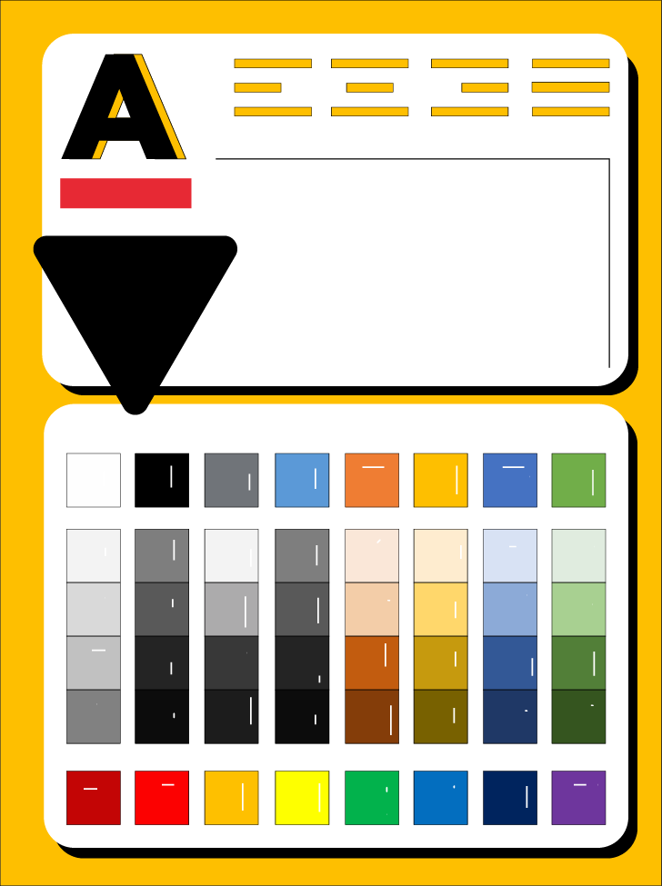
Style guides incorporate the colors, fonts, shapes, and icons they can use.
It makes it easier for audiences to associate such elements with your brand. It also ensures an easy transition of projects from person to person without stopping the work.
Most importantly, it reins in what the teams can do in terms of creativity. Interestingly, not very many companies have taken the time to come up with clear style guides. There is a general lack of understanding of why they are essential.
Even those who tried to create one find the process quite challenging. However, every organization should have one for consistency and a better brand identity.
A style guide covers specific aspects. These are:
-
Logo guide - the use and modifications that one can make
-
Color palette
-
Typography that looks at fonts and how to use them. It covers everything, including the use of upper and lower cases, bolding, and font color
-
The use of imagery
-
A voice that covers tone and language
The use of color in PowerPoint presentation branding
With a style guide, you know the colors you can use for corporate communication. When choosing colors for your PowerPoint slides, consider the following.
Contrast

Create contrast with PowerPoint backgrounds, graphics, text, and illustrations. Ensure a seamless blend for consistency. When using premade backgrounds, you can choose ones with the colors that will fit and complement the ones in your brand identity.
Font colors
Pay attention to the color you choose for the fonts. They should be legible at a distance. Make them stand out by contrasting colors. White font on a dark background, for example, will increase readability.
Evoke emotions
Use color psychology to evoke emotions depending on the takeaway you want your audiences to have.
-
Black can work well for presentations surrounding grief and luxury. It is mournful, solemn, and formal.
-
White is neutral, making it a popular option for most people when working on PowerPoint presentations.
-
Blue evokes feelings of tranquility, security, and Peace. Tech brands also commonly use it.
-
Green is interactive, warm, and works well for nature and environmental issues.
-
Orange is warm and flamboyant.
-
Yellow brings feelings of happiness and optimism.
-
Red is a tricky color; it brings out passion, but please understand the audience well. Some cultures have negative connotations associated with the color red.
However, certain color combinations can be distracting. Red and green, for example, can make your slide look busy or cluttered.
Choosing the right fonts for your PowerPoint presentation
A key determining factor when choosing your font is readability. Audiences should not struggle when trying to make out the text. Pay attention to the following:
Font size
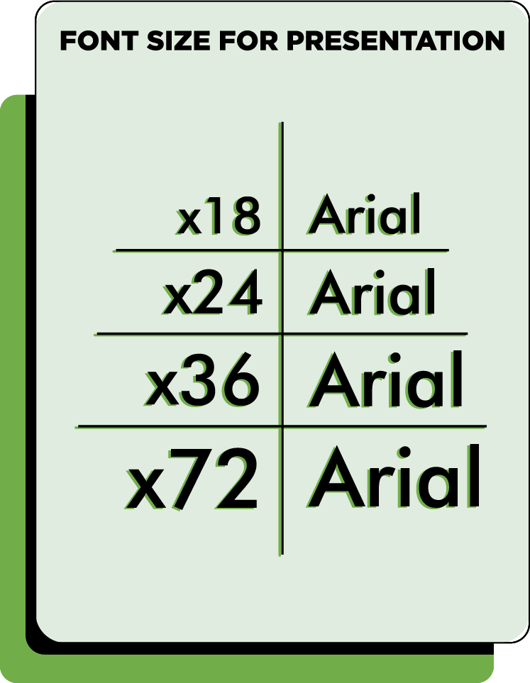
Font size for presentations should typically range from 24 to 30. Anything smaller and people at the back of the room will not be able to make it out.
It helps if you know the size of the screen you will be making the presentation on.
Font type
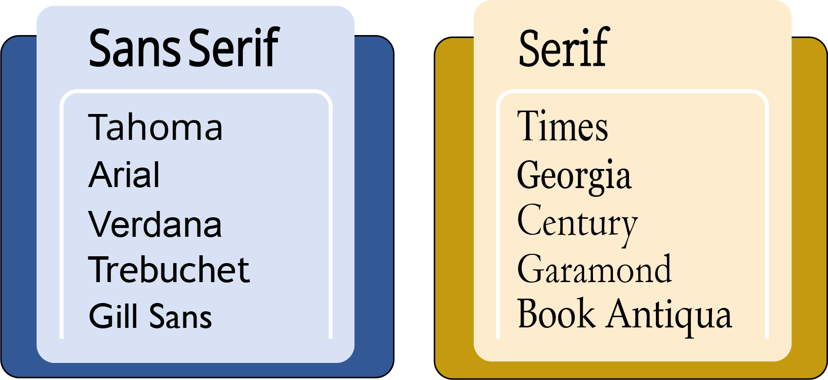
The audience you are presenting to determines the type of font you choose.
Top-level executives and other professionals require more “serious” or professional fonts. Go for Times New Roman and Arial.
Younger audiences are less rigid, giving you more flexibility with the more “fun” fonts. You can use serif, script, and sans serif for them. Other fonts to consider are Verdana, Palatino, Calibri, and Tahoma.
Number of fonts
Do not use more than three fonts in your presentation. If possible, stick to two. One should be for the titles/headers and the other for the main body. Your presentation will look cohesive and have a good flow.
Whatever you pick must adhere to the readability rule. These include size, contrast with the background, and type.
Your presentation may not be the best time to show off your creativity. Depending on the font you choose, it may distract the audience. Save the stylish or decorative fonts for birthdays and wedding invitations.
Incorporating logos into PowerPoint presentations
One of the most vital branding elements is your logo design. You may be wondering whether you should have it on every slide.
Different people have different thoughts about this. For some, having the logo on the first slide is enough. For others, the more, the better.
The more the audience sees the logo, the better their association with your brand will be. This is entirely a personal preference.
There are, however, specific factors you should have in mind.
-
The logo should not dominate the page, nor be too small, so be careful about sizing.
-
Place it in one corner of the slide. Don't use your brand mark as a background for your slides. It should not distract from what you're trying to communicate.
-
Take advantage of the color palettes in the style guide to tweak the logo so that it is in proper contrast with the background.
-
If you do not want your logo on every slide, here is what you should do. Place it on the first and last slide of your presentation. By having it at the beginning and end, you leave a lasting impression.
Use this video to learn how to place a logo on your PowerPoint presentation.
Final Thoughts
We have shared a simple guide on using color, font, and logos in a PowerPoint presentation. A style guide is essential for consistency.
It helps audiences build a connection with your brand. You also get the point of differentiation from your competitors.
There are some fantastic PowerPoint templates available. The advantage is that you can customize them to what you need. It saves time because you do not have to start from scratch.
Read more articles on design and inspiration:
Written by DesignCrowd on Wednesday, April 7, 2021
DesignCrowd is an online marketplace providing logo, website, print and graphic design services by providing access to freelance graphic designers and design studios around the world.
