An error-free logo design is the most prominent and effective communication tool for a brand. It conveys a brand’s character, message, and positioning. Since the brand identity universe is so vast and colorful, and the final product depends on a myriad of factors, mistakes occur and errors slip through. The best designers are aware of the most common logo design mistakes that happen during different stages of the process.
For the newbies and the amateurs, however, knowing what not to do is critical. It’s the only way they can perfect their art and ensure that their identity design projects are flawless and perfect.
Here, we are presenting the 7 logo design mistakes that happen way more than they should. We are sharing examples and also solutions.
So, let’s jump right in.
1. Obeying Trends

A good logo needs to be timeless; all the great ones are. Look at the Coca-Cola logo, Chanel, and Harley-Davidson. All of these logos are unique and free of the constraints of time. The feelings attached to these graphics transcend generations and decades.
But when you create a logo that follows the whims of trends, you put an expiry date on its identity. As the trends change, so may your logo designs’ relevance to modern times. So, while it’s important to stay abreast of the ongoing trends in design, it’s even more important to know not to follow them blindly.
The Fix:
Choose a trend if it makes innate sense to your brand and its image (the vibrant gradient logo for an aesthetics-oriented brand such as Instagram).
 But avoid them in all other scenarios. Modern logo designs such as Logodesign and BrandCrowd’s logo maker tool, especially those that use AI or machine learning, are great at sidestepping trends and remaining true to the merit of design.
2. Relying On Colors
Most impatient designers (and brands) rush to conclude their projects. This often results in logos that have never been tested in black-and-white. It’s the mark of a very weak logo because if you take away the color, does the logo still retains its uniqueness and connection to the brand?
Let’s see.
Microsoft, McDonald’s, and even Pepsi’s vague logo remain legible and understandable as logos of their corresponding brands even when you remove the colors.

But we can’t say the same for brand logos such as Target, for example. When you remove its color and text, it’s a simple circle, then, nothing else.

The Fix:
There’s no quick fix other than to design better. Always design your logo in black-and-white to ensure your work isn’t dependent on color or any other element. It must maintain its originality and identity when all the extra is stripped away.
3. Using Raster Images
A logo is a multipurpose brand asset. It needs to be on a website favicon, a billboard, a letterhead, and a dozen of other surfaces, in various sizes. Therefore, not thinking about scalability is a rookie mistake in the logo design process.
Logos that are in raster format are notoriously bad for scaling. They’ll retain their shape and form in a certain size but any lower and higher and the image will be too pixilated to remain coherent.
Vector images, conversely, are perfectly scalable. They not only retain their shape and form but also their quality. How? A vector graphic is created using mathematically precise points that allow for a change in size and orientation without damaging the graphic. Raster images, on the other hand, are pixels-based.
The Fix:
Most amateur designers work on Adobe Photoshop which produces raster graphics. Practice and perfect your craft on Adobe Illustrator so your work is always scalable.
4. Visually Cluttered
Logo designs, essentially, are communication tools. The more straightforward it is, the more clearly and accurately it’ll convey the message. Cramming too many elements in it or adding too many details will unnecessarily complicate the design.
It’ll also speak of an unsure brand identity. Using too many icons or too many colors will confuse the audience, making it harder to decipher which is the most important element or where the eye should go first.
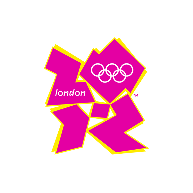
2012 London Olympics logo remains a prominent example of a visually cluttered identity. Too many icons, edges, angles, and shadows. Such designs are a mark of unclear design direction and poor design choices.

The Fix:
Keep things simple. Following an intuitive design process where every decision is backed by a strong brand strategy.
5. Copied Design
Designers, at the beginning of their career, often get too inspired by the work of other great designers. This practice, however, creates work that resembles another brand too closely. When you do that, you deprive your brand of its unique flavor. If your logo looks too much like another, that’s also free publicity for the other brand.
This common logo design mistake also happens when you haven’t done your research properly. You can then mistakenly create a logo that is substantially similar to another brand’s design.
The Fix:
It’s simple. Do your research and try not to feel too impressed by what you find. Keep your focus on the current project and learn as much as you can so you can create a unique design.
6. A Poorly Matched Style
Logo designs come in various styles. Some of the most common include a combination mark, a logo mark, an emblem design, and a wordmark. Each of these styles suits a unique brand character and industry.
For example, if you are creating a children-oriented brand such as fashion for kids, a combination mark with a relevant cheery icon plus friendly typography will suit the brand vibe the best. You can achieve the same friendly vibe in a wordmark logo by incorporating elements that look lively and kid-friendly.
Take Lego’s logo for example.

It’s a wordmark but the text is a little tilted and uses a chubbier, cheekier font. Plus the shade of red is perfect to make the brand look inviting and accessible. However, if you choose a serious-looking lettermark logo for such a brand, the effect may not be as impactful as you’d like.
The Fix:
Think of your brand’s soul, its character. Is it a friendly brand or represents a serious institution? Each style is suitable for a certain kind of business and industry. Find what naturally meshes well with your brand.
7. Nonresponsive Logo
We consume online content on multiple-sized devices. We keep going from laptops to various mobile devices throughout the day. Web or social media content that responds well to the changing sizes and orientations of our screens encourages us to engage with it the most.
This includes logo designs too.
If you create a logo design that does not adjust its size and layout when viewed on different screens, you are not doing your clients any favors. The audience expects better and other brands are delivering.
The Fix:
Learn how to create responsive logos. Customers keep shifting to different devices so it’s up to you to give them a brand experience that remains consistent no matter the screen size.
Bottom Line
Even the best of us make mistakes. Logo designs are no exception. However, it raises questions on your mettle as a designer if you keep making mistakes that are common, often repeated, and that everyone makes.
Hopefully, this discussion will help clarify important design concepts for you so you can perfect a process that contains no errors. And the more you practice, the more perfect it will be.
Read more about logo design:
Written by DesignCrowd on Tuesday, June 22, 2021
DesignCrowd is an online marketplace providing logo, website, print and graphic design services by providing access to freelance graphic designers and design studios around the world.

