A guest decides a lot about a restaurant before the food shows up.
The sign out front, the photos that came up first in search, the way the menu reads on a phone screen at a red light, all of it sets a price and a mood in someone’s head before anyone commits to walking in. A consistent logo design helps connect these touchpoints so the restaurant feels recognizable wherever guests encounter it.
Branding is that whole set of signals that follow, working whether or not it’s being paid attention to.
Done well, it earns something concrete.
People remember the place, trust it sooner, pick it over the spot two doors down.
Start With the Promise
The first question is what the restaurant actually promises, and to whom.
An owner who can’t say in a sentence what feeling a guest leaves with, who that guest is, and why this place over the three others on the block doesn’t have a branding problem yet. They have a concept problem.
A few things help when the picture’s still fuzzy:
- Five words for the experience at its best, the honest ones. Cozy, loud, elegant, whatever fits.
- The three nearest competitors. For each, a sentence on what this place does differently, or who it serves better.
- Then ten or fifteen images pulled together because they feel right. A dining room, a plate, a texture, a street sign set in a typeface worth stealing.
The pattern shows up on its own once they’re all in one place.
Personality drives the rest. A ramen counter that moves fast and talks back can’t wear the same look as a tasting-menu room running white cloths and a long wine list.
For restaurants serving international residents, understanding the local culture and lifestyle can also help shape a brand that feels welcoming to newcomers, as explored in this guide to living in Portugal as an expat.
What the Logo Has to Do
A good restaurant logo has one job: make the restaurant easy to spot, fast, at any size and in any context. Every choice either serves that or gets in the way.
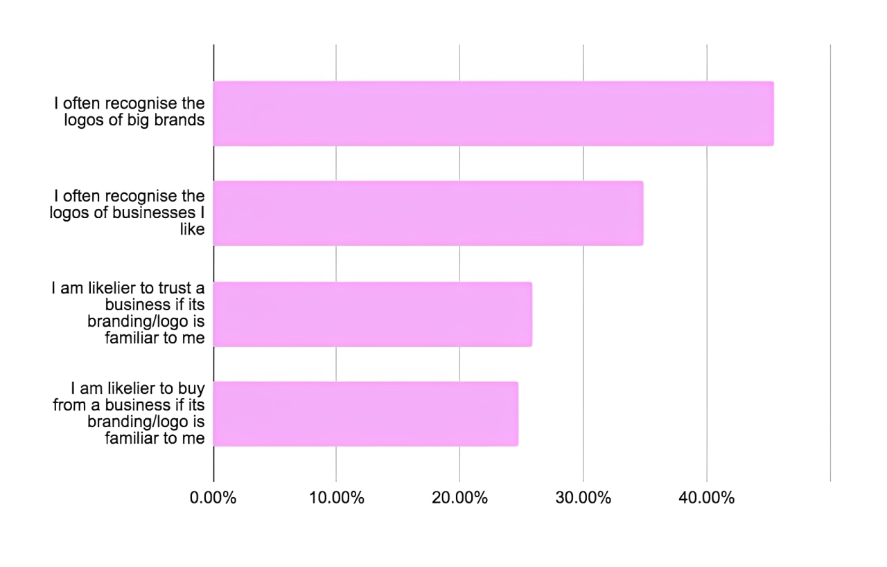
Image source
Simplicity does most of the work:
- Clean shapes hold up when the logo shrinks from a backlit sign to a 40-pixel app icon, and that range is the real test; recognition beats cleverness almost every time someone’s scanning.
- Beyond that, a distinctive detail helps; one odd letterform or a small emblem is often all it takes to stand out in a feed moving at thumb speed.
The mark also has to fit the food and service, not borrow a look from another restaurant. It also has to survive one-color and black-and-white printing, with tighter logo variations on hand for small spaces.
The same mark ends up embroidered or screen-printed on staff wear too, and a run of custom sweatshirts or caps will flatten any gradient or fine line the screen never had to handle, which is one more argument for a design that holds at a single color.
Color and type do more than people expect.
Color shapes how quickly an impression forms and how the brain files a brand (Singh, 2006), so the palette should match the room's energy, with a second set of colors held back for menus, signage, and the website.
Type needs testing where it’ll actually be read — dim light, arm’s length — and it works best as a small system: one font for headlines, one for body, something clean for numbers.
The failure modes are predictable.
Marks with too much detail fall apart at small sizes. Trend-driven logos look dated inside a year. A raster file can’t scale, which is why the handoff has to include vectors (.AI, .EPS, or .SVG).
And type that’s fine on a laptop can be unreadable on a dim menu or a phone. When simplicity and cleverness are fighting over a design, the tiebreaker is that people recognize familiar shapes far more easily than they recall clever ones.
Making It Hold Together
A guest meets a restaurant in pieces: the menu, the website, the takeout box, the shirts, the feed. When those pieces look like they came from the same place, the restaurant reads as considered. That impression is worth real money. It lands before the food does, and it shapes what a guest will pay and what they’ll forgive.
None of this needs a thick brand bible. The useful version fits on a few pages and covers:
- The logo, in the two or three forms it actually gets used in, down to the tiny icon that has to survive as a favicon.
- Color, written in hex and in CMYK, so a screen and a printed menu don’t drift apart.
- Type — one face for headlines, one for body, something plain for numbers, and a web fallback for when the licensed font won’t load.
- A paragraph on how photos get taken: the light, the angle, the crop. Add the illustration style if there is one.
- Spacing and hierarchy rules, loose but real. And a note on how the place sounds when it writes a sentence.
Get that down and ten printers and one overworked social intern stop inventing their own rules. Most of the writing starts as a chatbot draft these days. A quick pass through an AI content detector before anything ships catches the sentences that still sound synthetic, and those go back for a rewrite in the brand’s actual voice.
Repetition earns its keep. One small illustration, used again and again — a coaster, a menu corner, the flap of a delivery box — stops being decoration and becomes a tell. People start to recognize it. Photos do the same job: shoot them with the same light and the same distance every time, and a grid of them reads as one restaurant instead of a phone’s camera roll.
The chains everyone knows prove it out. Starbucks killed its wordmark in 2011 and trusted the siren to carry the name alone, a bet that only works because the mark is clean enough to read at app-icon size and across a storefront.

Shake Shack runs a line-art burger and a green that reads from across the street, friendly on a neon sign and on a paper tray liner alike. Sweetgreen reshaped its logo in 2021, rounder and warmer, then refused to let it drift — same look in the app, on the bowl, in the store.
Working With a Designer
Good design work starts with a good brief and an honest conversation. A Pinterest board and a vague feeling won’t get a designer there. What does that include: the concept, the audience, the competition, a clear read on how the kitchen and counter actually run, and examples of what feels right next to what feels wrong. That’s the raw material behind something distinctive that still holds up on a Tuesday lunch rush.
Fit matters more than polish.
A portfolio with hospitality or retail work and a track record of building systems is worth more than a gallery of one-off logos. The brief should spell out goals, audience, competitors, tone, non-negotiables, and the full deliverable list — logo files, menu templates, social assets, signage specs.
Constraints belong in that first conversation, not the third round: print methods, materials, sign dimensions, ADA requirements, whatever the POS can and can’t display. Those shape better design, not less creative design.
Feedback is where projects go sideways. “I like it” and “I don’t” tell a designer nothing.
Reacting to whether an option actually expresses the brand (too stiff, too loud, reads fast-casual when the place is a date spot) gives them something to move on.
Plan for rounds, because good work gets there through revision, mockups seen in context, a sign tested in real daylight. And settle files and rights at the end, so the handoff includes vectors, usage rights, and a short style guide to keep things consistent later.
Branding Across the Guest Journey
Visual identity runs the length of the visit — the search result, the website, the walk in, the check at the end — and the room has to deliver whatever the screen promised.
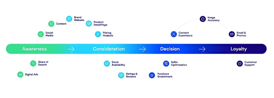
Image source
Inside, most of it is wayfinding and small moments. Clear, well-placed signage takes the friction out of finding the door, the bar, the bathroom. Menu layout steers the eye to what should land first. Color and a repeated icon can ride along on a uniform or a water glass without making a show of it. Even the folder the check arrives in is a branding surface, for better or worse.
Ordering kiosks and handheld terminals carry the brand now as well, down to the loading screen and the button styling, which puts the logo and the colors in the hands of whoever writes the embedded software running those devices.
Online, the job is to meet people where they already are.
The website should be fast, work on a phone, and clear the accessibility bar, meaning alt text, enough color contrast, and text that’s actually readable, per WCAG guidance. The things a guest came to do should be obvious and one tap away: see the menu, book a table, order delivery, get directions.
The Google Business Profile does more lifting than owners expect. Current hours, real photos, and a complete listing can build profiles that earn more engagement, and most people read reviews before they ever visit.
Measurement doesn’t have to be elaborate.
- On the site, the signals worth watching are clicks on Reserve and Order, menu views, and how long people stay on the page.
- Search and maps add calls, direction requests, and photo views. Social is better read through saves and shares than likes.
- And in the room itself, measure table-turn time, how many faces come back, and a one-line question at the end of the meal.
When a single post or ad seems to move the needle, UTM tags are what tie the reservation spike back to it (Google URL Builder).
Where This Is Going
Branding isn’t a project that closes. It’s showing up the same way, every place a guest runs into the restaurant, on an ordinary week.
What’s coming is mostly more of the screen.
Logos that move. Marks that respond to the size and shape of wherever they land. Menus that sell straight from a social post, and websites built to be usable by everyone rather than most people.
The platforms and the habits will keep shifting. The actual goal won’t, like a visual identity that’s true to the food, the people making it, and the night a guest actually has. Trends are worth a look when a refresh is due. A clear foundation is what keeps the refresh from turning into a reinvention.
For anyone starting, small and specific beats sweeping. Name the feeling. Pick a logo simple enough to survive. Put it, carefully, in the few spots a guest notices first. Then keep doing that.
Not every owner has a designer on call. DesignCrowd is one way to close that gap: post a logo or branding brief and designers from around the world send back custom concepts to choose from, usually well under agency rates. For the kind of simple, durable mark that holds up everywhere a guest runs into it, it’s a practical place to start.
Written by DesignCrowd on Friday, October 30, 2026
DesignCrowd is an online marketplace providing logo, website, print and graphic design services by providing access to freelance graphic designers and design studios around the world.
