The Best Free Fonts for Designers.
Fonts are probably the most valuable resource for a graphic designer. The choice of typeface can be the difference between good or bad design. I've curated a list of the best, professionally designed fonts which are suitable and free for use. I've selected old-style, traditional and modern and slab serifs, humanist, geometric, grotesque, neo-grotesque and modern/techy sans serifs and a script face. I kept the list concise because having too many fonts can be overwhelming and it makes font choices hard. Read on and download the awesome fonts featured on this list and I am sure they will become your favorites in no time.
Note:
a) I would like to thank all the font designers and foundries for sharing all these great fonts for free.
b) Even though typeface and font are not interchangeable terms, they have been used thus so that everyone can understand the article.
c) These fonts are 100% free for commercial use in graphic design projects but please refer to their EULAs for specific guidelines about redistribution, modification, reselling and other uses etc.
25+ Free Fonts

Crimson is a beautiful old-style serif inspired by Garamond and the works of Jonathan Hoefler, Jan Tschichold and Robert Slimbach. Crimson features over 7000 glyphs across 3 weights and their corresponding italics. Great for long chunks of text and can be used as a display font too. Available in TrueType Format(TTF).
Designer : Sebastian Kosch

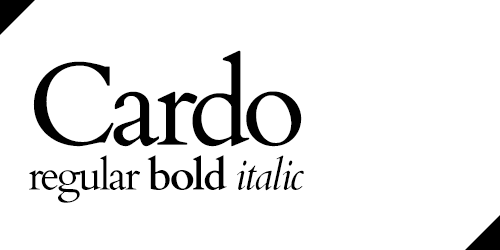
Cardo is an old-style serif font with modernistic serifs and cleaner and sharper strokes. "This font is my version of a typeface cut for the Renaissance printer Aldus Manutius and first used to print Pietro Bembo’s book De Aetna. This font has been revived in modern times under several names (Bembo, Aetna, Aldine 401). I chose it mainly because it is a classic book face, suitable for scholarship, and also because it is easier to get various diacritics sized and positioned for legibility with this design than with some others." Available in TTF.
Designer : David Perry

Forum is a transitional serif font. The principles of classical architecture can be seen in combination of its direct and rounded lines - vertical climbing pilasters, semi-circular arch, a horizontal cornices. It is intended for titles and headlines but can be used to set body texts too. Available in OpenType Format(OTF).
Designer : Denis Masharov
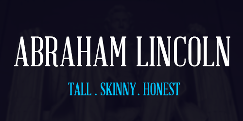
Abraham Lincoln is a modern serif font. Inspired by the proportions of the 16th President of the USA, and advertisements/playbills of the 1800s, Abraham Lincoln is a humanistic display face with moderate contrast and sturdy serifs. Available in TTF.
Designer : Frances Macleod
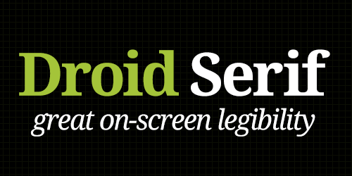
Droid Serif is part of the Droid font "super-family" designed by Steve Matteson of Ascender Corp. Droid is a modern serif font but with moderate stroke contrast and a humanistic touch. It has an impactful appearance. Droid Serif features slightly condensed letterforms to maximize the amount of text displayed on small screens. Vertical stress, sturdy serifs and open forms contribute to the readability of Droid Serif. Droid Serif family has four fonts: Regular, Italic, Bold & Bold Italic.
Designer : Steve Matteson
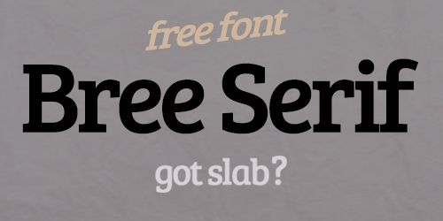
Bree is a slab-serif font with chunky serifs and humanistic strokes. This friendly upright italic is the serif cousin of TypeTogether's award winning font Bree. Bree was originally released in 2008 and it became an immediate success because of its originality, charming appearance and versatility. Bree Serif was initiated with the help of Google webfonts and will be expanded with more font styles later this year. The new serif style adds some extra flavor to this tasty font and it is available for free. Available in OTF.
Designers : Veronika Burian and Jose Scaglione

Kontrapunkt is a slab-serif with a techy character. It features strokes with abrupt width changes which makes the font unique and provide it with its modern character. It comes in 2 weights and 1 italics. Available in OTF.
Designer : Kontrapunkt Design Agency

Geared is an industrial inspired Condensed Slab Serif that comes in 4 weights (Thin, Regular, Bold, Extrabold). Geared is great for an industrial or rugged look. With an extensive character set, Geared could be a versatile addition to your next project. Available in TTF.
Designer : Ben Dalrymple

Lobster is a really well designed and nicely thought out script face. The original Lobster font has been expanded into a family with 2 upright weights and 2 italics; the original font is the "Bold Italic". Version 2 features more than 70 ligatures and 35+ terminal forms; which means that the characters like "e" at the end of words will have smaller tails. This typeface makes full use of the OpenType features. Available in OTF
Designer : Pablo Impallari

Delicious is a pretty well known free font family from exljbris Font Foundry. Delicious is unmistakably humanistic and has a delicate feel to it. You can even use it to replace the irreplaceable Comic Sans. It has a large x-height and nearly proportional character widths that give it a unique and homogenic look. The font has an airy feel to it and will work great where a relaxing look is needed. It can be used at small point sizes too. Available in OTF. Bonus : It comes in 3 weights with 2 true italics and regular small caps.
Designer : Jos Buivenga


Anivers is a really flexible font. It has angular, low contrast strokes with the essence of its geometric influence Museo(another great font). The font has a lot of potential in terms of usage. It was designed by Jos Buivenga of exljbris to celebrate Smashing Magazine's 1st anniversary, thus the name. The regular weight is available for free download and the whole expanded family can be bought. Available in OTF. Registration at MyFonts required.
Designer : Jos Buivenga

Mank Sans is a humanist typeface with an airy and pure look. It has a friendly character and can be used where Helvetica can't. Available in OTF with two weights and italics.
Designer : Manfred Klein

Sansation is slightly squarish modern sans-serif with a wide character width. Sansation has clean and modern letterforms and some unique and unusual glyphs; such as the "ajar" A, B, K, R and P glyphs and an unusual lowercase "k". Its a unique typeface but it does not go overboard with that. Available in TTF.
Designer : Bernd Montag

Fontin is a humanistic face designed to be used at small sizes. It is a semi-serif font with small serifs which are not very prominent and basically part of the letterforms. The font has an overall warm feel and readable on-screen at small sizes. It's available in Roman, italic, bold & small caps. The color is darkish, the spacing loose and the x-height tall. Available in OTF(recommended) and TTF.
Designer : Jos Buivenga

Fontin Sans is the sans compliment for Fontin. Fontin Sans has a more clear and formal letterform than the original Fontin. It provides the perfect contrast for Fontin and because both the fonts share the same base, they have a lot of similarities that make them easy to combine and mix in a layout. Jos Buivenga is also working on a serif-font called Fontin Serif which will be a great addition to the family.
Designer : Jos Buivenga

Source Sans Pro is Adobe's first open source type family. A rational design approach was followed by simplifying glyph shapes by paring them to their essential form, while adding some detail in order to more easily differentiate similar letter shapes (such as uppercase I and lowercase L). Source works great in short strings of text as well as longer chunks. Source Sans Pro has been designed with a more generous width than other comparable gothics, and its shorter majuscule letters, combined with minuscule letters with longer extenders, create a more pleasant reading texture in longer text passages. Available in OTF.
Designer : Paul D. Hunt

Fabrica is a Grotesque typeface. Fabrica is a deceptively simple sans serif typeface optimized for screen display on handheld devices. With its optimal quality and legibility, Fabrica proves to be highly efficient for small screens. Fabrica has neutral tone of voice which helps concentrating on the text matter itself. Above all, Fabrica's beauty is found in its functionality. Although Fabrica was developed primarily for mobile screen, the typeface is suitable in any applications, large or small sizes. It has a medium x-height and a long ascender-line
Designer : Alvin Kwan

Geo Sans Light is a geometric typeface with a thin stroke. It has a medium x-height and a long ascender-line. It has an elegant form and is great for display purposes at larger sizes(too thin for small sizes). Available in TTF.
Designer : Manfred Klein

Code Pro is a font family, from Font Fabric, inspired by the original Geometric Sans-Serif fonts like Avant Garde or Futura, but with a modern twist. It is clean, elegant and straight-to-the-point. Code font is applicable for any type of graphic design—web, print, motion graphics, 3D design etc.—and perfect for t-shirts and other items like posters and logos. 2 free weights available in OTF.
Designer : Svetoslav Simov
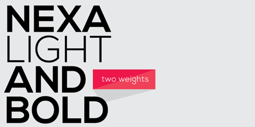
Nexa is modern geometric typeface. Nexa has an elegant form which is more delicate than Code Pro. It is characterized by excellent legibility in both - web & print design areas, well-finished geometric designs, optimized kerning etc. Nexa is most suitable for headlines of all sizes, as well as for text blocks that come in both maximum and minimum variations. The font styles are applicable for any type of graphic design in web, print, motion graphics etc and perfect for t-shirts and other items like posters, logos. 2 free weights available in OTF.
Designer : Svetoslav Simov

Nexa Slab is a geometric slab serif font whose design is based on the Nexa. Nexa Slab draws from the rich traditions of the Neo-Grotesque serif fonts such as Lubalin Graph, Rockwell and Memphis . Just like these fonts, it’s design is subject to rational, thick and thin, low contrast bars. The letters are characterized by the strict geometry and square proportions of the original, extra-fortified by suitably balanced slab serifs. Nexa Slab is serious without being rigid and inflexible, finished and lacking in nothing, systematic without being monotonous. 2 free weights available in OTF.
Designer : Svetoslav Simov

Novecento is an uppercase-only font family inspired on European typographic tendencies between the second half of 19th century and first half of the 20th. Novecento embodies elegance and finesse. It looks rational and geometric. However, it is optically corrected and balanced. This font face is designed to be used mostly for headlines, visual identities or short sentences, both in big and small sizes. Lighter faces provide a more contemporary and design look & feel, while the bolder ones definitely look retro. 6 free weights(wide)available in OTF. Registration at MyFonts required.
Novecento complete family comes in 32 styles, speaks 76 Latin based languages, has 471 glyphs and 12 OpenType features for advanced typography.
Designer : Jan Tonellato

Liberation Sans is an Open Source font family from Red Hat, intended to replace the likes of Arial. The stroke contrast is low and the x-height large. It can be used at large display sizes and at small text sizes. I recommend using Liberation instead of Arial. Available in TTF.
Designer : Steve Matteson

Liberation Serif is the serif counterpart of Liberation Sans. It goes perfectly with Liberation Sans. It has medium contrast strokes and vertical serifs with slanted brackets. It is a great typeface for long chunks of text. Available in TTF.
Designer : Steve Matteson

Bebas Neue is the new and improved version of Bebas, originally released in 2005. Neue features more sturdy and mature glyphs with vertical terminal strokes. The font has a condensed form with a bold stroke. It is a great font and used on many websites. It is great for print too, especially t-shirt design. It is really versatile and can be used in variety of contexts. Available in OTF.
Designer : DharmaType

A modern sans-serif typeface with a pure clean line form. The idea has been to design a font with a proportioned and balanced structure that is applicable to a wide variety of uses. Free regular with italic. Available in OTF.
Designer : Jonathan Hill

Dekar is clean and modern font from FontFabric. The font comes in two weights, light and regular. The design of the typeface is very modern and somewhat futuristic. The line forms are basic and have foundations in geometric shapes. Dekar is great for use at large sizes. Available in OTF.
Designer : Svetoslav Simov

Orbitron is a geometric sans-serif typeface intended for display purposes. It features four weights (light, medium, bold, and black), a stylistic alternative, small caps, and a ton of alternate glyphs. Orbitron was designed so that graphic designers in the future will have some alternative to typefaces like Eurostile or Bank Gothic. Orbitron is suitable for anything related with computers, technology and science fiction. It can a provide a sharp and crisp look to any design layout. Available in OTF.
Designer : Matt McInerney

Prime is a simple typeface with a techy feel and a strict, geometric origin. I wanted to create something that offers great readability in various sizes yet still offers enough subtle differences to stand out. Basic and somewhat neutral, it can be used in a variety of ways from distinct titles to body text. Prime is versatile and great for achieving a modernistic look. It is a great choice for 3D projects. Available in OTF.
Designer : Max Pirsky
Conclusion
So now you can add these awesome fonts to your arsenal and start using them in your freelance design projects. Or try our font logo creator on BrandCrowd for more ideas.

Written by DesignCrowd on Monday, December 23, 2013
DesignCrowd is an online marketplace providing logo, website, print and graphic design services by providing access to freelance graphic designers and design studios around the world.
