Here’s a quick exercise: close your eyes and think of a brand logo.
Done? We bet you thought of logos of brands like Coca-Cola, Nike, or Apple.
The reason why these logos quickly came to your mind is that they are timeless logos. They were not done by copying the latest trends, but by embodying the core identity of the company. This is why no matter how much time has passed, these logos still feel fresh, modern, and unmistakably tied to their brands.
Want to create a logo design that is as iconic and timeless as theirs? We’ll break down below the five proven design principles that make a business logo timeless, so make sure you read on!
Principle #1: Simplicity
Notice how popular logo designs like McDonald’s, Target, or Nike are incredibly simple in nature?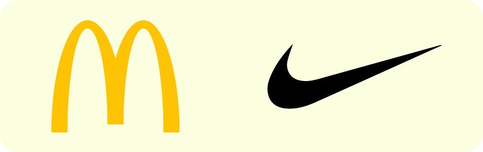
This is because the human brain is wired to recognize simple shapes better than complex or intricate patterns. Thus, the simpler your logos are, the easier it is to recognize and remember them.
Plus, the more minimalist your design, the less likely it is to go out of style. That’s because these logos are founded on timeless elements like geometric shapes and classic colors rather than fleeting design trends.
Here’s how to achieve simplicity in your logo:
- Focus on one main idea.
- Avoid using too many colors, overly decorative fonts, or excessive details.
- Follow the graphic design fundamentals to create a visually balanced and clean look.
- If you want to be more creative, play around with the elements you already have instead of adding more. For example, experiment with the negative space, change the perspective, or use a more unique color scheme.
Pro Tip: Struggling with coming up with more subdued logos? Make use of Design.com’s specialized logo templates like minimalist logos or clean logos to find simple designs fit for different industries.
Geometric Minimal Animal by Design.com
Forest Pine Woods by BrandCrowd
Gold Chandelier Light by Design.com
Luxury Real Estate Tower by BrandCrowd
Gateway Arch Monoline by Design.com
Minimal Beach Surfboard by BrandCrowd
Minimal Flower Vase by Design.com
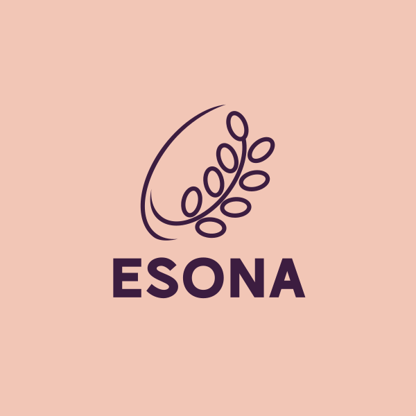
Orchid Flower Shop by BrandCrowd
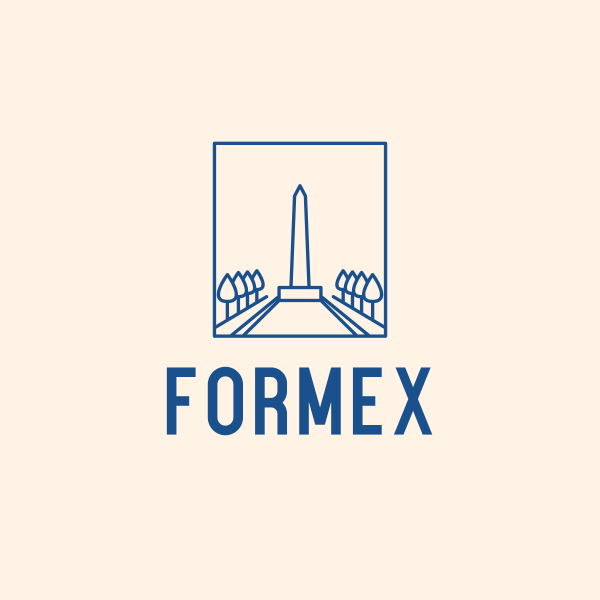
Washington USA Monument Obelisk by Design.com

Animal Mouse Frame by BrandCrowd
Principle #2: Versatility
Your logo is not just going to exist in one place.
They will be everywhere – whether as a small app icon, blown up into a huge signage in your office, printed on a glossy business card, or embroidered on a t-shirt.
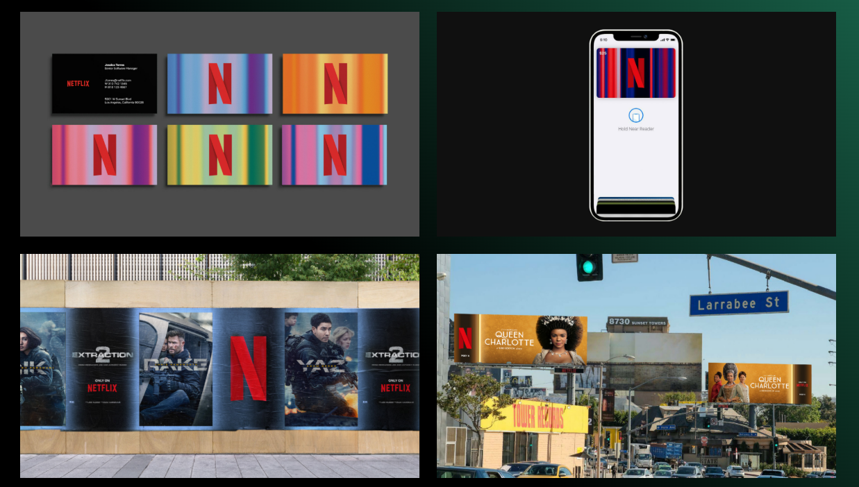 Source: Netflix
Even the colors won’t always be the same. You may have to adjust them if you're planning to do seasonal branding, or they may be printed as black and white on your invoices or other documents.
This is why you must design with versatility and adaptability in mind. A great timeless logo is one that works in various formats, color, size, and context.
Here’s a handy checklist to see if your logo is versatile enough:
- Does it work on light and dark backgrounds? A good logo shouldn’t disappear or clash with different backdrops.
- Can it scale down without losing clarity? Thin lines or complex details may vanish at small sizes.
- Is the text readable when small? This is especially important if you’re using a wordmark logo.
- Will it look good with additional elements? There may be a time when you have to add seasonal elements like a Santa Hat or change the colors to red for Valentine’s.
Pro Tip: BrandCrowd’s logo maker tool lets you preview how your business logo will look across different mockups and platforms. This allows you to spot any issues before you finalize your design. Principle #3: Relevance
A great business logo reflects your brand personality, industry, and target audience. It should also align with the tone, mood, or overall vibe that you want to convey.
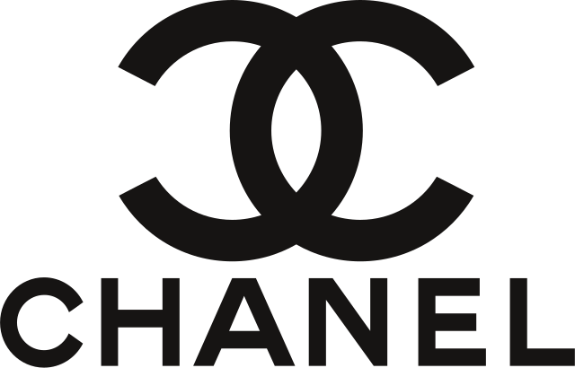
An example is Chanel’s logo. It features a minimalist wordmark paired with simple interlocking letter C’s that serve as its emblem. It’s sophisticated and elegant, perfect for the luxury brand.
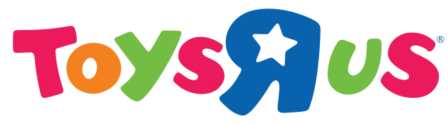
Meanwhile, Toy’s R Us logo is cutesy, colorful, and whimsical. The bubbly logo is more suitable to the brand since they mainly cater to younger audiences.
Ask yourself these logo design questions:
- Does it align with your brand values? Think about your core values and identity. Do you want to be seen as playful and cheerful? Knowledgeable and reliable? Friendly and approachable?
- Is it appropriate for your niche? What works great for an industry may be inappropriate for you. For example, a gaming logo can be bold and edgy, but a law firm will prefer more professional and traditional designs.
- What does your audience like? Your audience’s demographics (age, gender, location) will have an influence on their aesthetic preferences. For instance, younger people prefer lighter colors while older people prefer darker hues.
Pro Tip: Try browsing niche-specific logos like tech logos, food logos, or wellness logos. This should help you identify common patterns or styles across industries, which you can apply to make your design more relevant.
Pattern Business Tech by BrandCrowd
Developer Tech Pyramid by Design.com
Food Truck Delivery by BrandCrowd
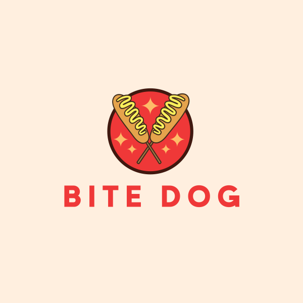
Snack Food Corndog by Design.com
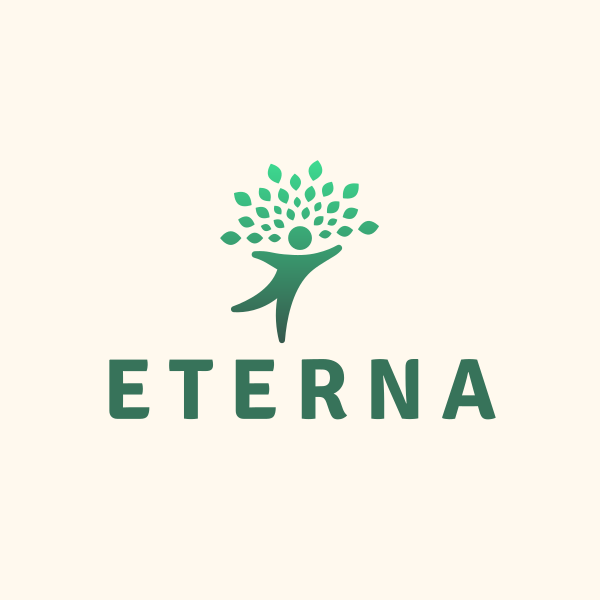
Tree Human Wellness by BrandCrowd
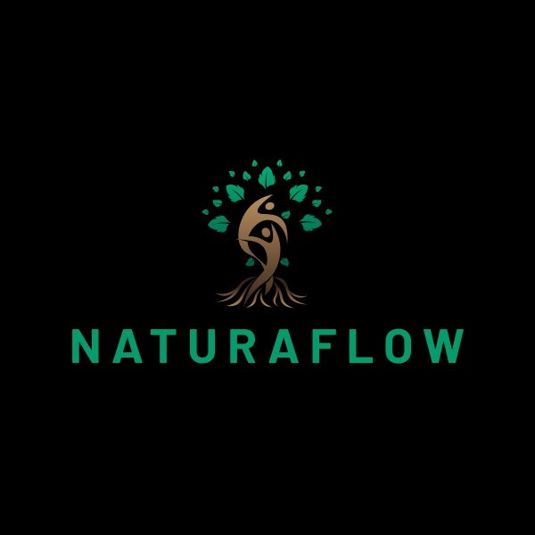
Human Tree Wellness by Design.com
Principle #4: Memorability
Your logo should stick in people’s minds after a quick glance.
Now, this doesn’t mean the design should be flashy or over the top. Rather, it’s all about having a distinct twist, something that sets you apart from others.

An example is Apple’s logo. Apple brand name = apple in their logo. Simple, right? But using a fruit made them stand out from all the other tech brands that use plain wordmarks or simple geometric shapes.
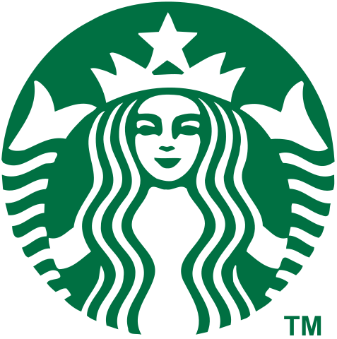
Another is the Starbucks logo. Most coffee brands either have a wordmark logo or use a coffee cup or coffee bean as a design element. But Starbucks went for their now iconic green siren, which makes them stand out. What’s more, is that the logo is a reference to the coffee industry’s seafaring roots. Meaningful and memorable, a win-win!
Some tips to create a memorable business logo are:
- Go for a strong and distinct shape, color, or typography. Ideally it should be something unique to your industry.
- Incorporate a subtle but distinctive detail, like the hidden arrow in FedEx logo.
- Avoid generic clipart.
- Limit color palette to 2-3 harmonious tones as they are easier to remember.
Pro Tip: Want to test your logo’s memorability? Show your friend your logo for five seconds. Ask them what they can remember or try to have them draw it from memory. If they can’t remember it, it’s time to simplify your design.
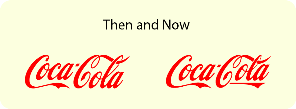
Principle #5: Longevity
A logo should be able to last years.
Take a look at Coca-Cola and IBM. Their logo remains the same, only with minor refreshes. This is why their logo is so popular and timeless.
You can do this by using classic design elements as your foundation rather than trendy elements. Think serif fonts, geometric shapes, or simple color palettes. These elements will never look dated, unlike if you follow fads like extreme gradients, glassmorphism, or Y2K style fonts.
Now this doesn’t mean you can never use any trends in your design. You can still use them, but only choose one trend, and make sure that is relevant to your business.
For example, you can use Mocha Mousse as your color if you want to embody a cozy and warm vibe. Or maybe use a doodle logo since it looks more approachable and friendly. The point is, you need to use your brand’s identity as your foundation rather than a design trend to make it timeless.
Some more tips are:
- Go for function rather than flair.
- Think of how your design will look in 10, 20, or 30 years.
- Consider your design in various contexts or platforms. For instance, a glitch effect might not be visible when shrunk down to a small favicon.
- Stick to classic fonts.
Pro Tip: Look for logo templates marked as “classic” or “traditional” for long-lasting appeal.
Conclusion
Whether you’re starting a business or rebranding, you need to get your logo design right. After all, it’s the face of your business – one that will represent you for years to come.
And if you want a lasting logo, then you need to focus on the five principles we mentioned above. By following them, you can create a business logo that not only looks great today but even decades from now.
Read more about logo design:
FAQs on Logo Design Principles
What are the five design principles for a great business logo design?
The five principles are simplicity, versatility, relevance, memorability, and longevity. These principles not only help you make effective logo designs but also timeless ones that can remain relevant even as design trends come and go.
What’s the most important principle for a timeless business logo?
While all five matter, simplicity is often the most critical. A clean and simple design is easier to adapt, remember, and keep relevant over time.
How many colors should a timeless logo have?
It’s best to stick to two or three colors. This keeps your logo easy to remember and adapt across platforms.
Do I need a professional designer to create a timeless logo?
Not necessarily. With the right tools, like Design.com’s logo maker, and by following the five design principles, you can create a strong and lasting design yourself.
Can I use AI to create a business logo?
Yes, an AI logo generator can also produce professional, high-quality designs. Still, it’s best to customize the generated designs to ensure they fit your preferences and vision and adhere to the five design principles.
Faviola Publico is an SEO Content Writer specializing in branding and digital marketing strategies. Outside of work, she enjoys reading slice-of-life novels and watching any mystery thriller-themed series.
Header Image by Selwyn Legaspi
Written by DesignCrowd on Tuesday, October 7, 2025
DesignCrowd is an online marketplace providing logo, website, print and graphic design services by providing access to freelance graphic designers and design studios around the world.
