Some brands command attention the moment you land on their website. You feel it right away. The colors, the spacing, the typography – they all send a clear signal that the brand operates on a different level. You trust it faster. You assume the product costs more. You expect quality.
Premium brands make deliberate design choices that create that impression. They understand how small details shape the way people judge value, credibility, and craftsmanship.
A generous amount of white space. A restrained color palette. A typeface that feels intentional rather than trendy. These elements work together to build a visual identity that communicates confidence and care.
You can learn these principles and apply them to your own brand as well.
Here, we’ll break down the specific design decisions that make brands look premium, and explain why they work from a psychological and practical standpoint. You’ll walk away with clear, actionable steps you can use right away.
Material Choices Make Quality Visible
People judge quality long before they touch a product. Texture, finish, and weight do most of the talking in those first seconds. The same principle applies to visual branding, where texture in logo design can add depth and help communicate a particular quality or personality. A heavy zipper pull, a matte-finish box, or a fabric with visible grain suggests care went into the build.
Naming specific materials matters just as much. “Brushed stainless steel” reads as more credible than “premium metal,” since specificity signals real knowledge of the product.
Close-up photography does similar work online, showing stitching, grain, or precious stone settings customers would otherwise only notice in person.
None of this works alone, though. A brand that leans on plush packaging and moody lighting without real substance behind it risks looking staged. Provenance details and sourcing specifics give shoppers a reason to trust what the visuals suggest.
How to Apply This to Your Brand
- Start by naming materials precisely on product pages instead of relying on vague marketing terms like “high-quality,” “premium,” or “luxury.”
- Show texture up close. A macro shot of stitching, edge finishing, or a clasp mechanism tells customers more than a glamour shot could.
- If there’s a real story behind sourcing, manufacturing, or craftsmanship, put it on the page rather than burying it in an “About” section nobody reads.
- Small details like weight specs, material grades, or care instructions matter too. They signal you know your product, and that confidence shapes how customers perceive its value.
See It in Action
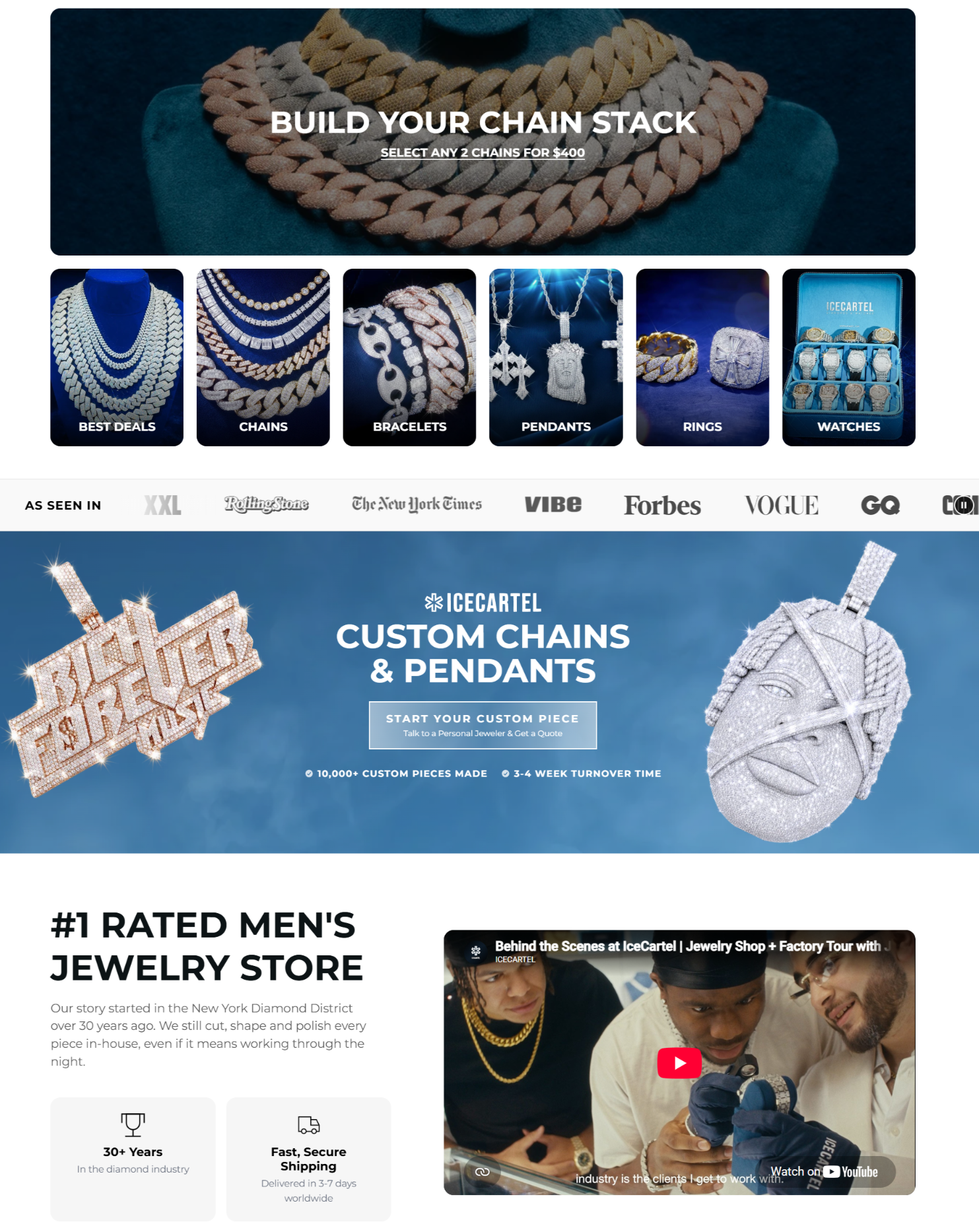
An example of this approach is Icecartel, a jewelry brand offering moissanite pieces for men.
Their website lists materials, including 925 silver bases with 14K gold plating and VVS-rated moissanite stones, instead of terms like “fine jewelry.” Close-up shots show stone settings and chain links in detail. The brand also provides an origin story in New York’s Diamond District, where its team has cut and polished pieces in-house for decades.
This combination of specific materials, visual proof, and a documented production history supports the brand’s premium positioning.
Source: icecartel.com
Restraint Creates a More Deliberate Visual Identity
Adding more to a design often feels like the safer move, but premium brands tend to do the opposite. They use whitespace generously, letting products and messages breathe instead of fighting for attention.
- Color palettes stay narrow, usually two or three tones used with discipline across every touchpoint.
- Typography follows the same rule – one or two typefaces, applied consistently, rather than a different font for every headline.The same principle applies when creating a logo, where a simple and intentional design can make a brand more recognizable. A logo maker can help businesses explore these design choices without starting from scratch.
- Photography stays uniform in lighting, angle, and background, so a customer recognizes the brand instantly across a website, an ad, or a shelf.
- Decorative elements get used sparingly, if at all, so the ones that do appear carry real weight.
This kind of restraint signals confidence. A brand that doesn’t need to shout for attention comes across as sure of its value.
Purposeful simplicity looks different from a design that’s simply empty, though. The difference lies in intention. Every removed element is being cut on purpose, and what remains carries clear meaning.
How to Apply This to Your Brand
- Audit your own site or packaging and remove anything that doesn’t serve a clear purpose.
- Pick a color palette with two or three core tones and stick to it everywhere, from your website to your packaging.
- Choose one primary typeface and one secondary one, then resist adding more.
- Standardize your photography style, including lighting and backgrounds, so every image feels like it belongs to the same brand.
See It in Action
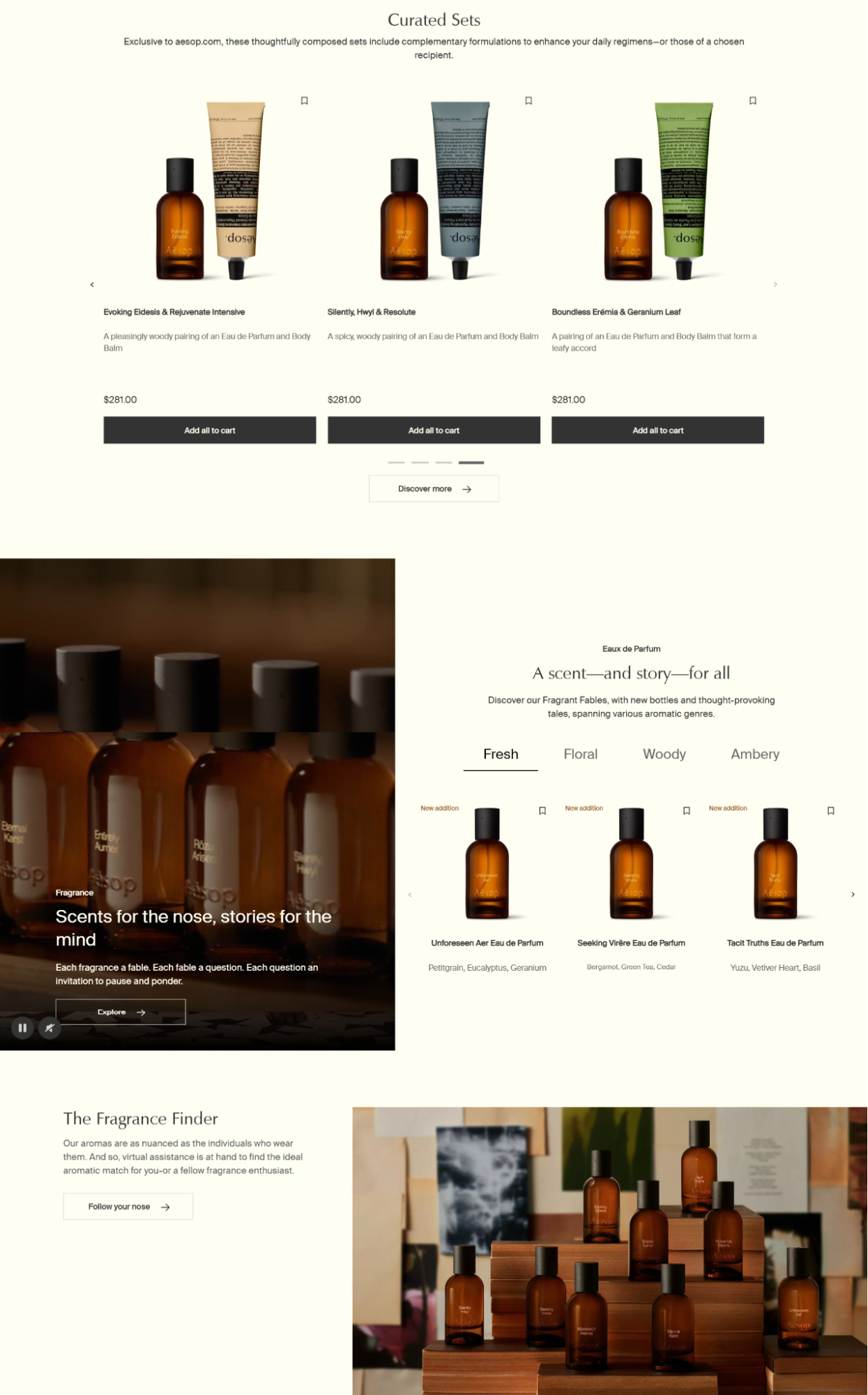
Aesop, a skin, hair, and body care brand known for its apothecary-style products, built its entire identity around this idea.
Its amber glass bottles use plain black-and-white labels with clinical, no-frills typography across every product line. The brand’s website follows the same restraint, using neutral colors and minimal graphics that stay consistent from page to page.
That consistency makes the brand feel deliberate and confident, without a single loud visual cue.
Source: aesop.com
Everyday Products Feel More Premium When Their Category Cues Change
A basic object stops looking basic once you change how it’s made, shown, and talked about. Swapping plastic for stone, wood, or ceramic instantly shifts a product’s category in a customer’s mind, even if its function stays identical.
Packaging plays the same role. A rigid box with a magnetic closure reads differently than a plastic clamshell, regardless of what’s inside. Photography matters too. Shooting a product like a design object, with soft shadows and negative space, moves it away from “commodity” and toward “collectible.”
Naming and descriptions carry this even further. Calling something a “diffuser” rather than an “air freshener,” or describing notes like “cedar atlas” and “golden amber” instead of just “potent scent,” reframes a cheap category into a more sensory one.
The product still needs to work as promised. These choices don’t replace function. They just change the lens customers use to judge value.
Language alone can shift this perception. Studies on everyday items like ceramic mugs, soap, leather goods, and stationery found that framing them as handmade rather than machine-made made them noticeably more appealing, with many participants saying they’d pay up to 17% more.
How to Apply This to Your Brand
- Rename your products with words that describe their craftsmanship or sensory qualities rather than using generic category names.
- Change your descriptions to emphasize materials and production methods instead of focusing only on what the products do.
- Use photography that appears deliberate rather than purely functional.
- Ensure that your packaging materials are consistent with the narrative of your brand.
See It in Action
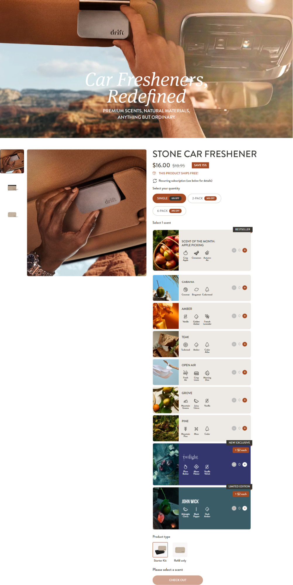
Drift, a brand selling car and home air fresheners, shows this clearly.
Instead of the usual cardboard tree, Drift sells scent blocks shaped from wood, stone, and metal, described with fragrance notes like bergamot, teakwood, and golden amber rather than plain scent names.
That vocabulary, paired with design-forward packaging, turns a cheap car accessory into something closer to a curated fragrance product.
Source: drift.co
Consistency Makes a Brand Feel Carefully Controlled
A striking logo or a beautiful package can grab attention, but premium perception depends on what happens after that first glance. That same consistency is important when creating a timeless business logo, since the visual mark needs to remain recognizable as the brand evolves. It comes from consistency across every touchpoint a customer runs into.
Typography, colors, photography, layouts, packaging, product naming, and tone all need to feel like parts of the same system, not separate decisions made at separate times. When a brand’s Instagram feed looks nothing like its website, or its packaging uses a different color palette than its store signage, customers pick up on that mismatch even if they can’t name it.
Small inconsistencies chip away at the sense of care that premium positioning relies on. A slightly different logo lockup here, an off-brand font there, and the whole experience starts to feel improvised rather than intentional.
Repetition works the opposite way. When the same visual rules show up again and again, customers start to recognize the brand instantly. That recognition builds trust over time.
How to Apply This to Your Brand
- Document your core visual rules – your color palette, your typefaces, your photography style, and your tone of voice.
- Apply them everywhere, from your packaging to your social captions to your email footers.
- Audit your existing touchpoints for inconsistencies.
- Fix the ones that break the pattern rather than letting them slide as one-offs.
See It in Action
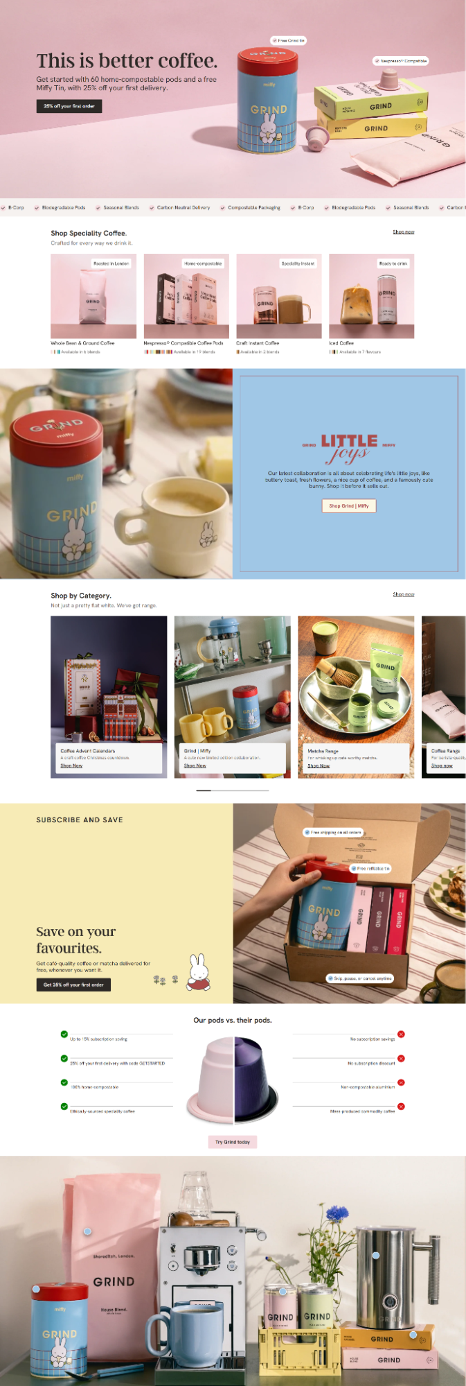
A brand that applies this well is Grind, a coffee company known for its sustainable sourcing, cafés, and direct-to-consumer specialty coffee.
Its brand voice stays optimistic, witty, design-led, and a little irreverent everywhere it shows up, while still reading as premium. Its recognizable assets go beyond its cute bunny logo. The pastel tins, the packaging design, and the warm sans-serif typeface all repeat consistently.
Whether a customer meets Grind on its website, aboard a flight, on social media, or in one of its coffee shops, the experience feels like the same world. That repetition is what makes the brand feel deliberately managed rather than thrown together.
Source: grind.co.uk
Small Details Signal How Much Care Went Into the Experience
Customers rarely evaluate quality through one big decision. They read it in the small ones.
- Packaging construction, the weight and fold of a box, the way a lid closes, all send signals before a product gets used.
- Typography hierarchy tells customers what matters most on a page, guiding attention without them noticing they’re being guided.
- Product-page interactions, like smooth zoom on images or a well-organized size chart, suggest the same care that went into the product itself.
- Labeling, photography consistency, and unboxing sequences all add up the same way.
None of this works as decoration on its own, though. The best finishing details support usability and reinforce the brand’s identity at the same time, rather than existing purely to look nice. A beautifully designed box that’s hard to open undercuts the very care it’s meant to signal.
Customers consider these details important. For instance, research indicates that packaging can change a customer’s perception of a product’s value by up to 45%. This makes packaging one of the most effective design decisions a brand can make.
How to Apply This to Your Brand
- Walk through your own customer journey step by step, from the product page to the unboxing moment.
- Note where the experience feels rushed or generic.
- Fix typography hierarchy so the most important information stands out first.
- Invest in packaging construction that matches your positioning.
- Make sure labeling and photography stay consistent across every product in your line.
See It in Action
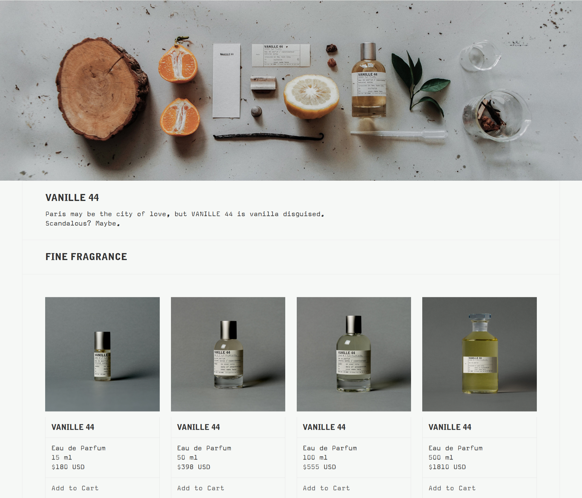
Le Labo, a fragrance company that sells perfumes, custom scents, candles, and skin care products, structures its customer experience around a central concept.
Its product and category pages show both the ingredients and the finished products in photographs with similar lighting. These images are displayed with a color scheme of black and grey, and use a font that resembles typewritten text.
Every element on each page has a purpose. The product names, ingredient images, and simple design all illustrate the process of creating each scent. This allows customers to see how each product is made, rather than only the final result.
Source: lelabofragrances.com
Final Thoughts
Premium perception comes from choices that customers can see, feel, and verify. Materials, restraint, reframed category cues, consistency, and small details all work together to shape how people judge value before they experience the product itself.
When those signals align, your brand feels intentional, credible, and worth more.
You can apply these principles to your own brand. Start with one area:
- Analyze and rethink your materials.
- Simplify your visuals.
- Change how you describe your products.
- Standardize your touchpoints.
- Refine your finishing details.
Over time, these choices compound. Your brand will start to feel premium because it will act premium. Customers will immediately notice the difference.
Written by DesignCrowd on Friday, October 16, 2026
DesignCrowd is an online marketplace providing logo, website, print and graphic design services by providing access to freelance graphic designers and design studios around the world.
